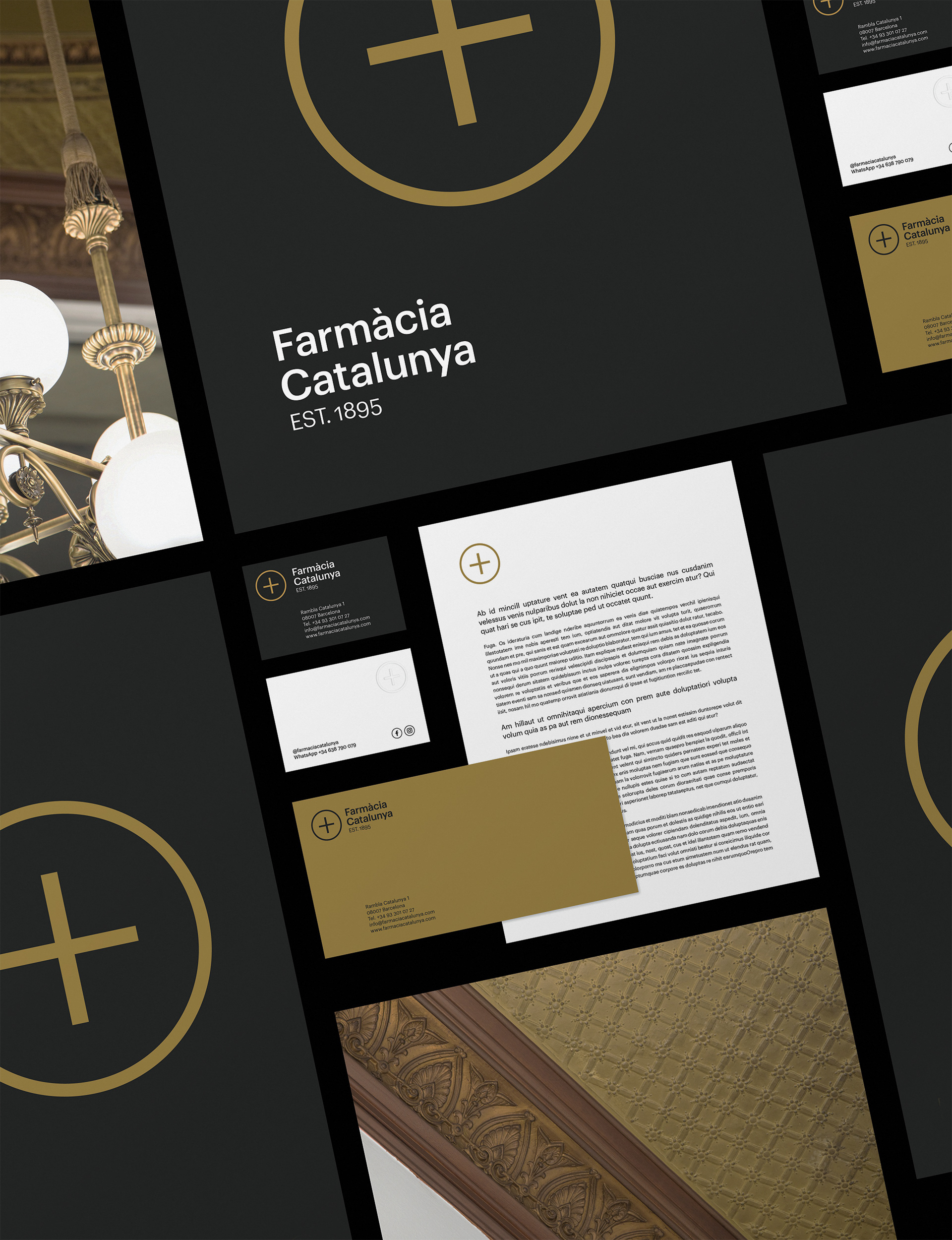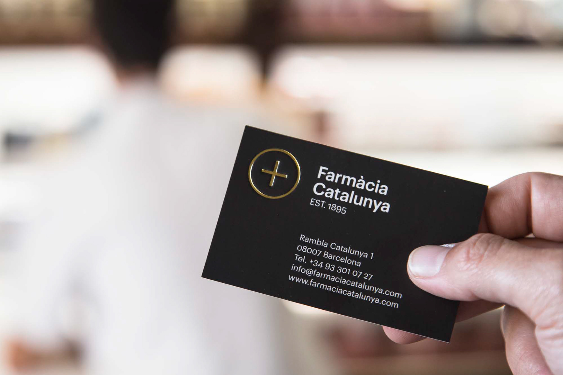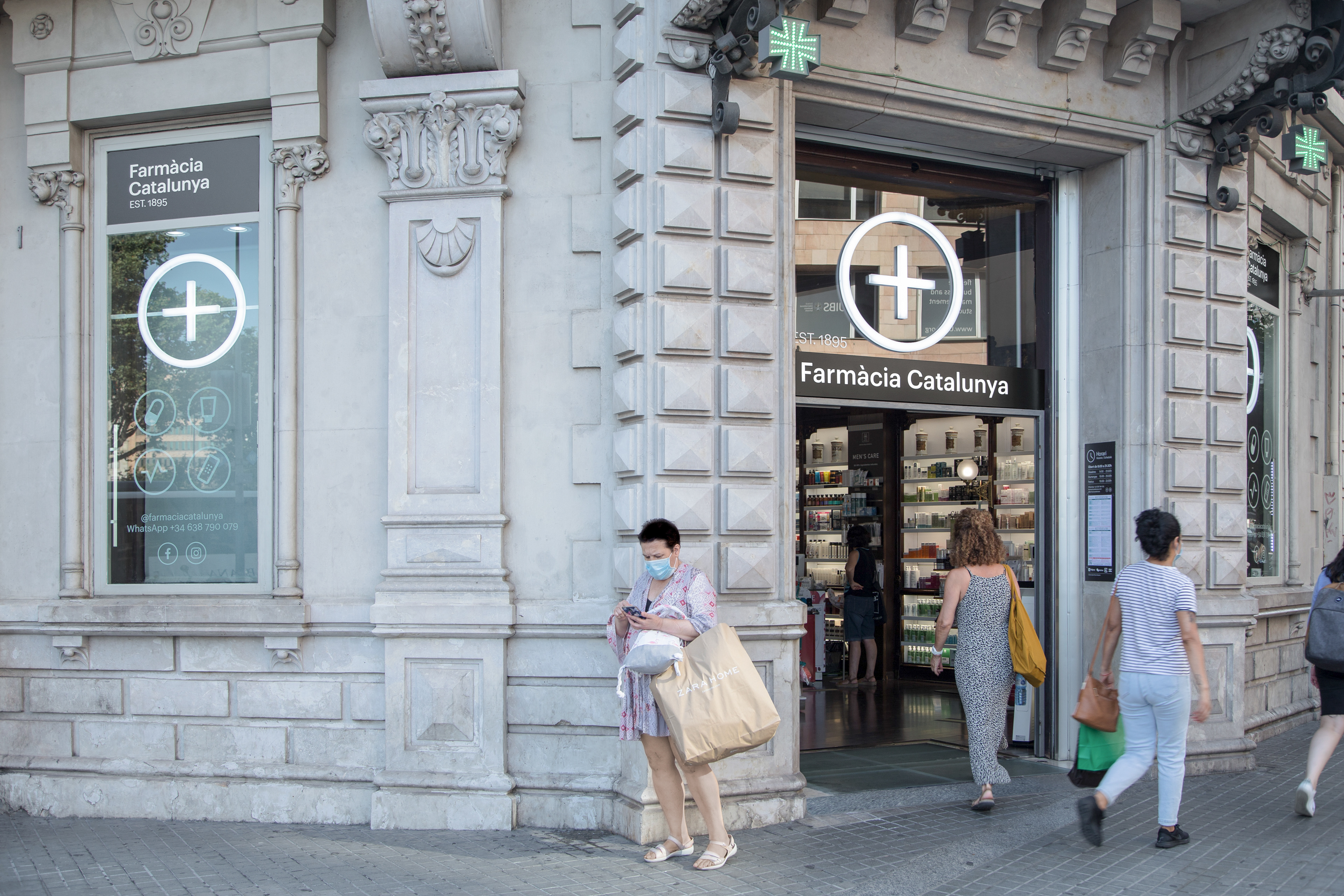
Farmàcia Catalunya
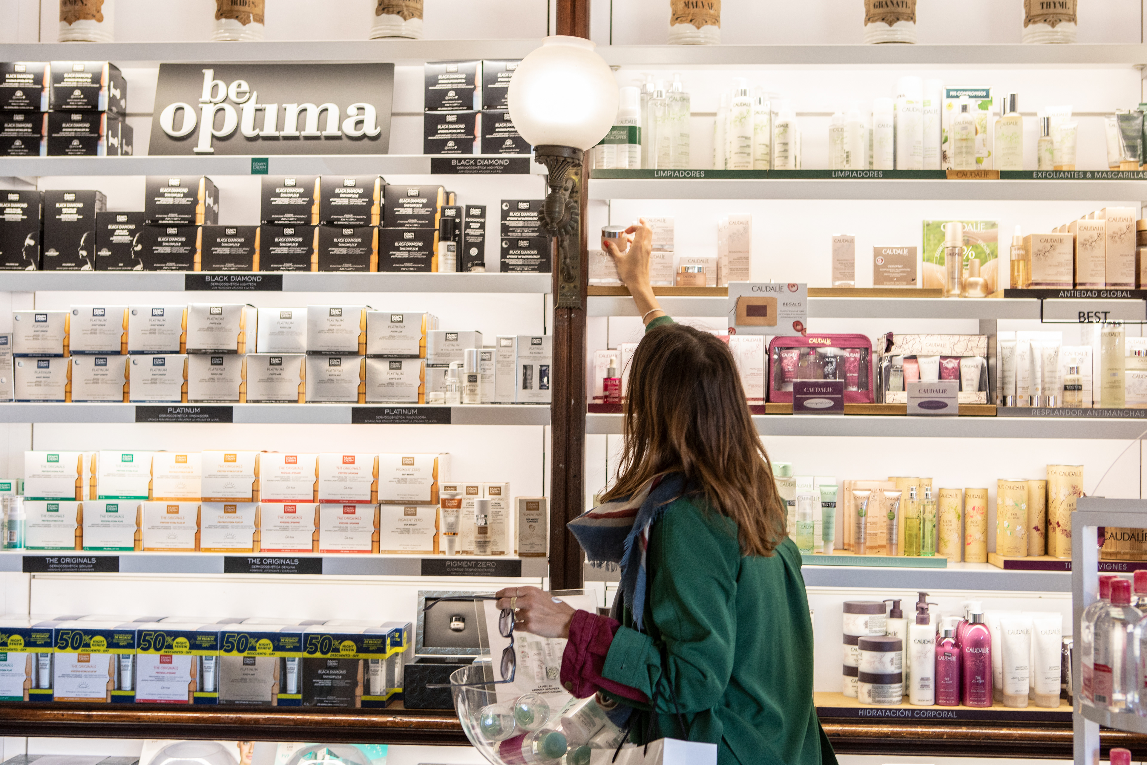
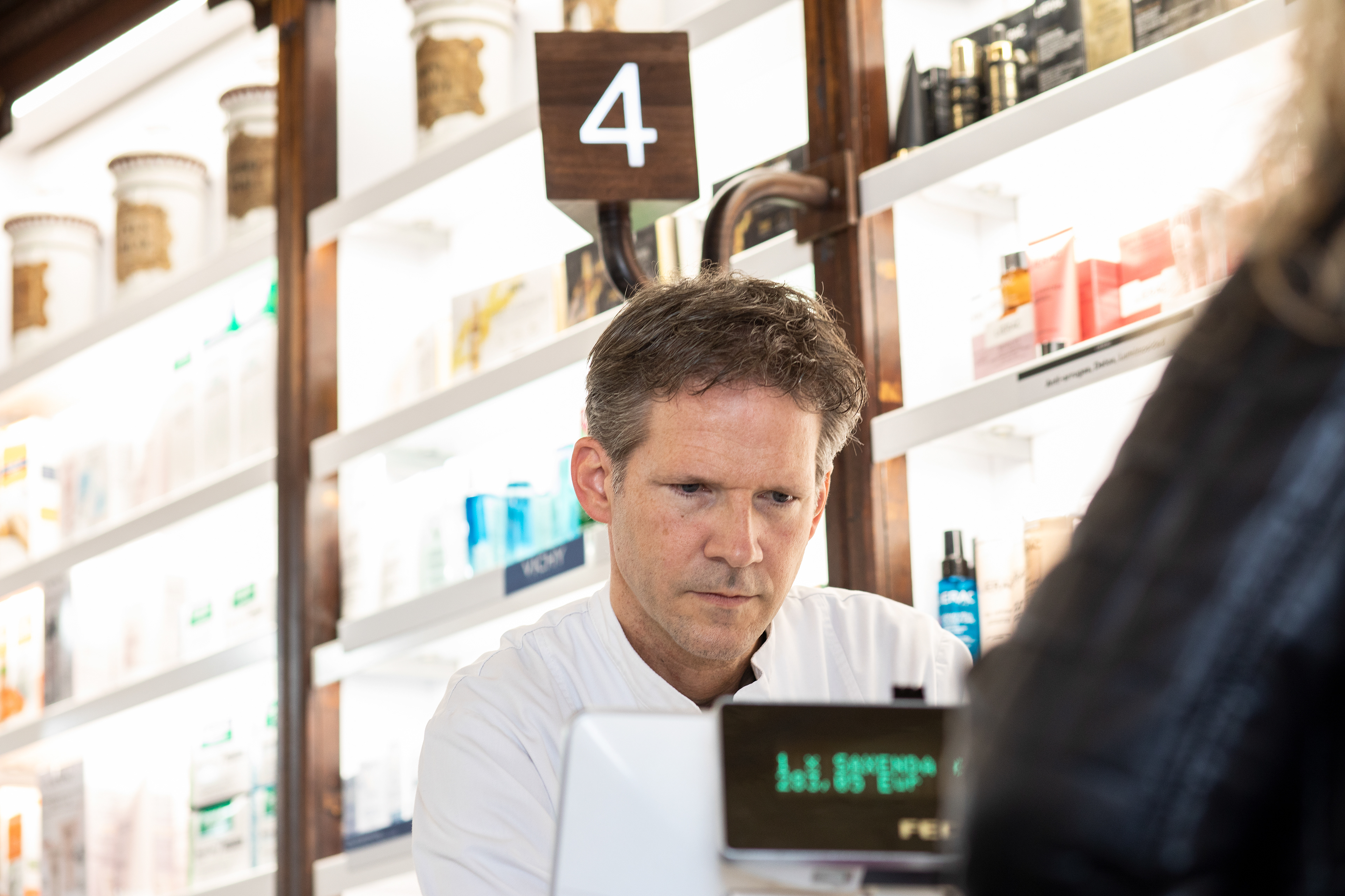
The objective of Farmàcia Catalunya's rebranding was to situate the pharmacy as a health reference point in the center of Barcelona, Plaza Catalunya.The location is surrounded by stimuli, visual interference and movement of local people, zone workers, neighbors walking, passing tourists, etc. and each public has its needs. The fifth generation in front of the business has had to modernize the way to working adapting to the needs that customers demand.
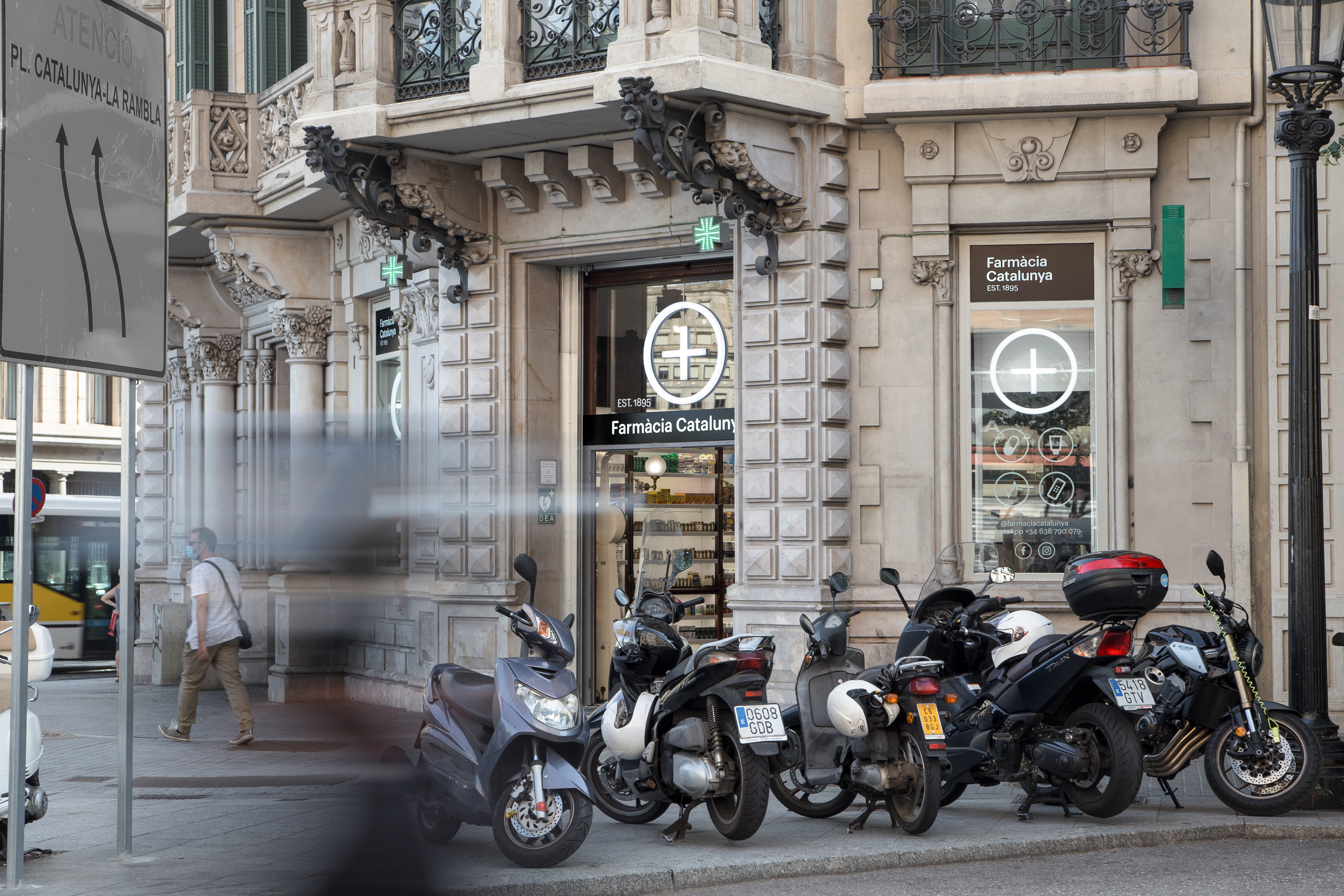
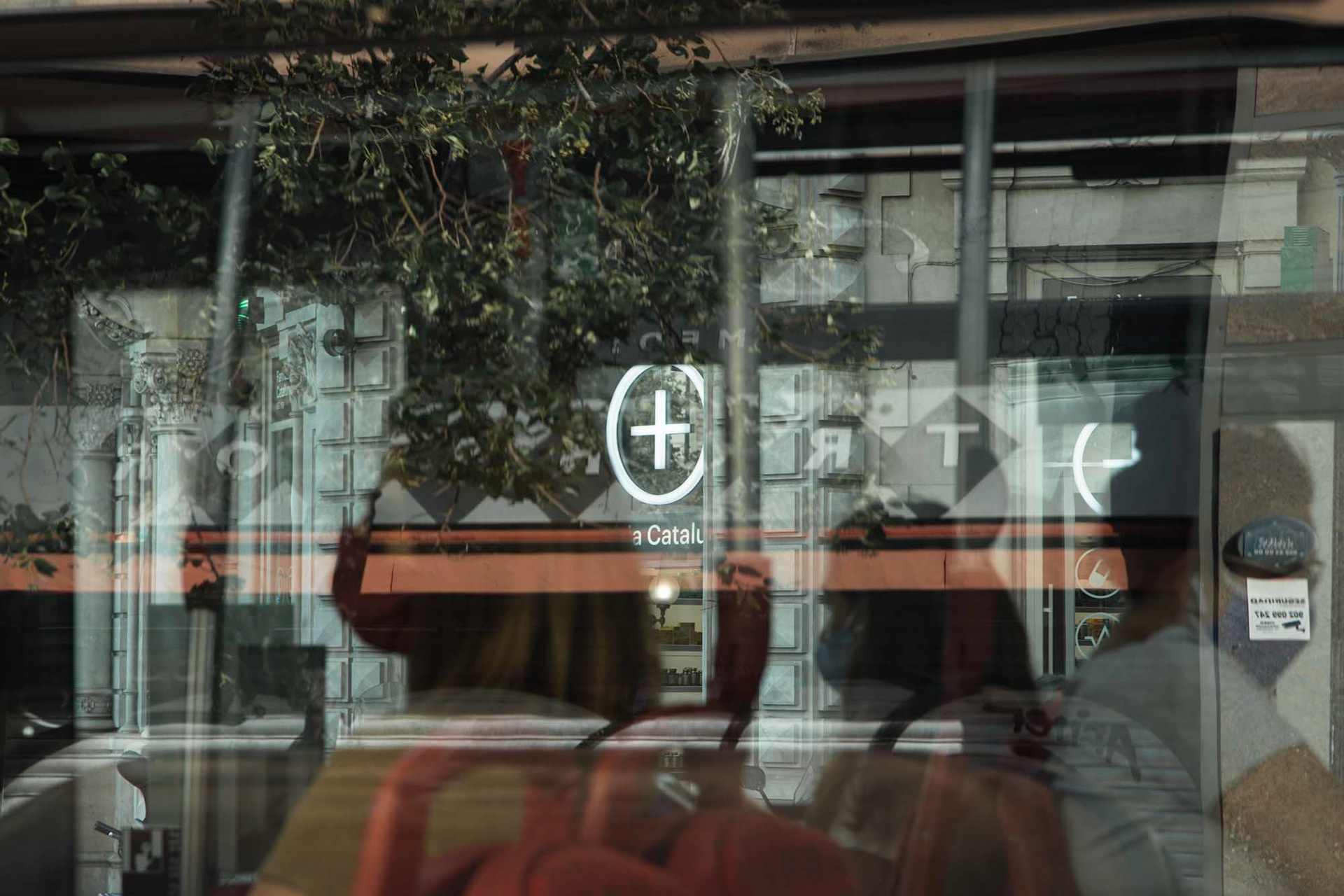
Farmàcia Catalunya is the most iconic square's pharmacy in Barcelona.

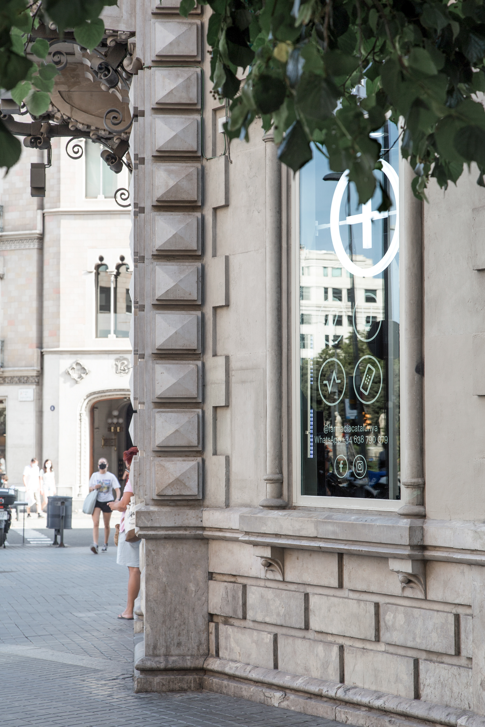


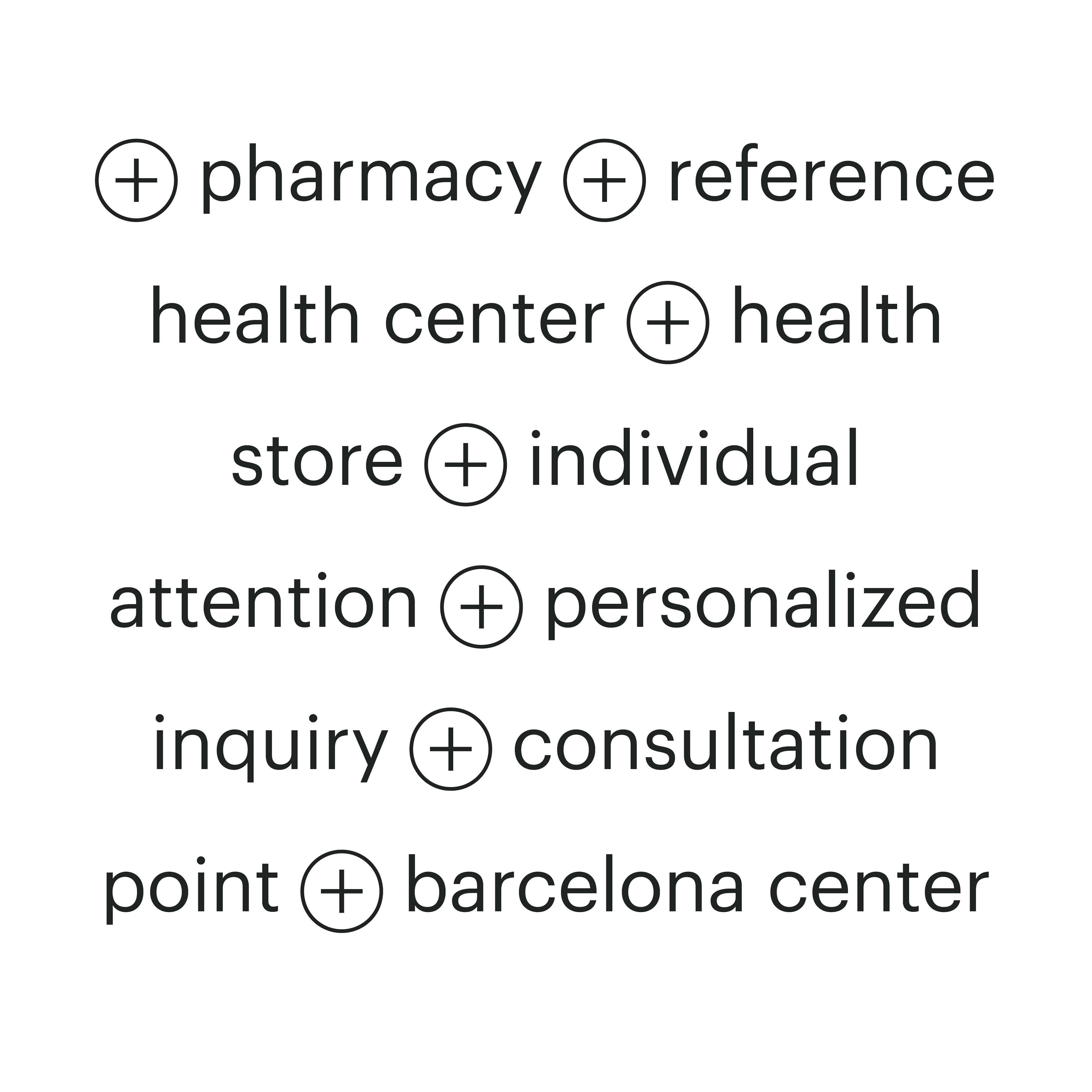

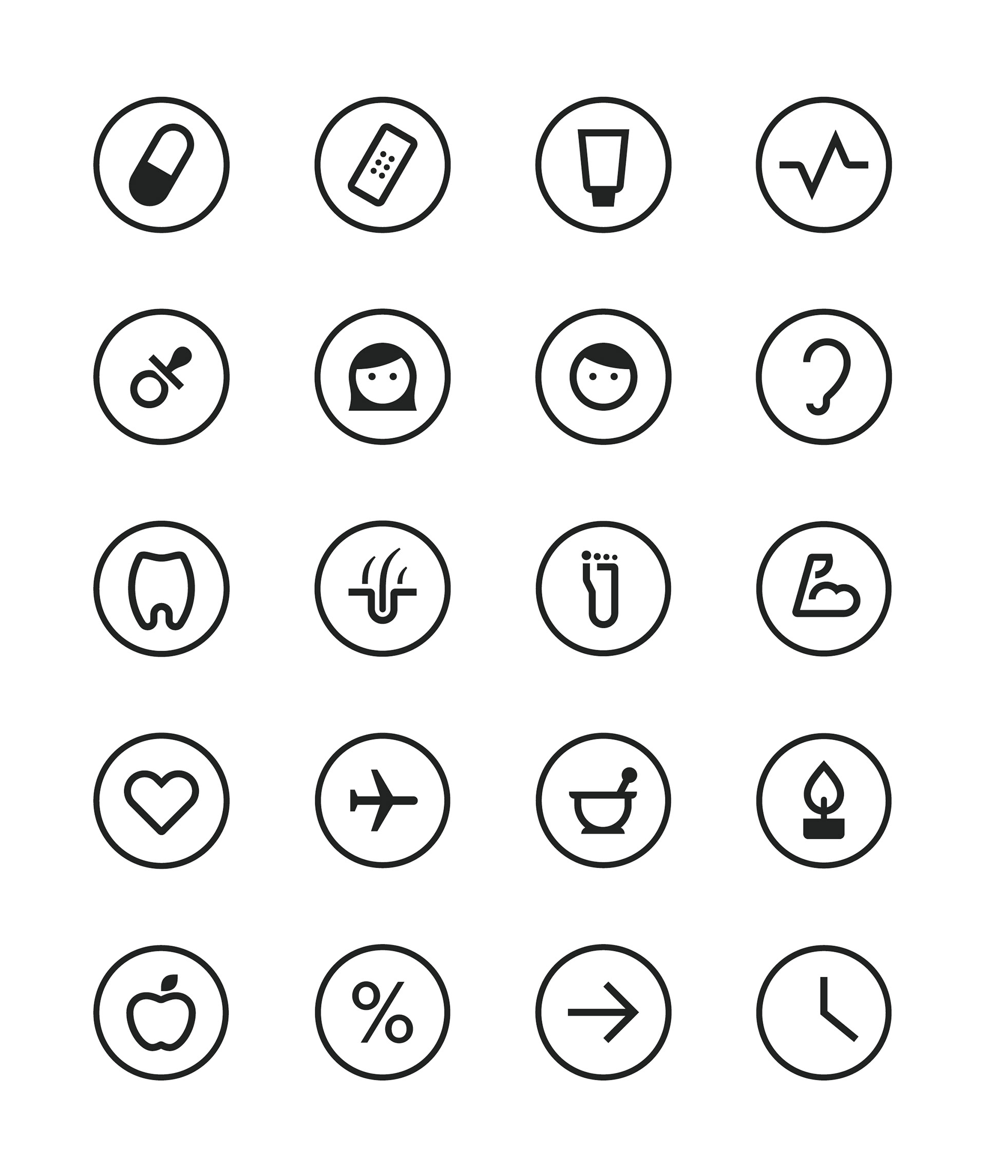
We create a basic icon system for the classification of products and services that are easily identifiable for audiences around the world.
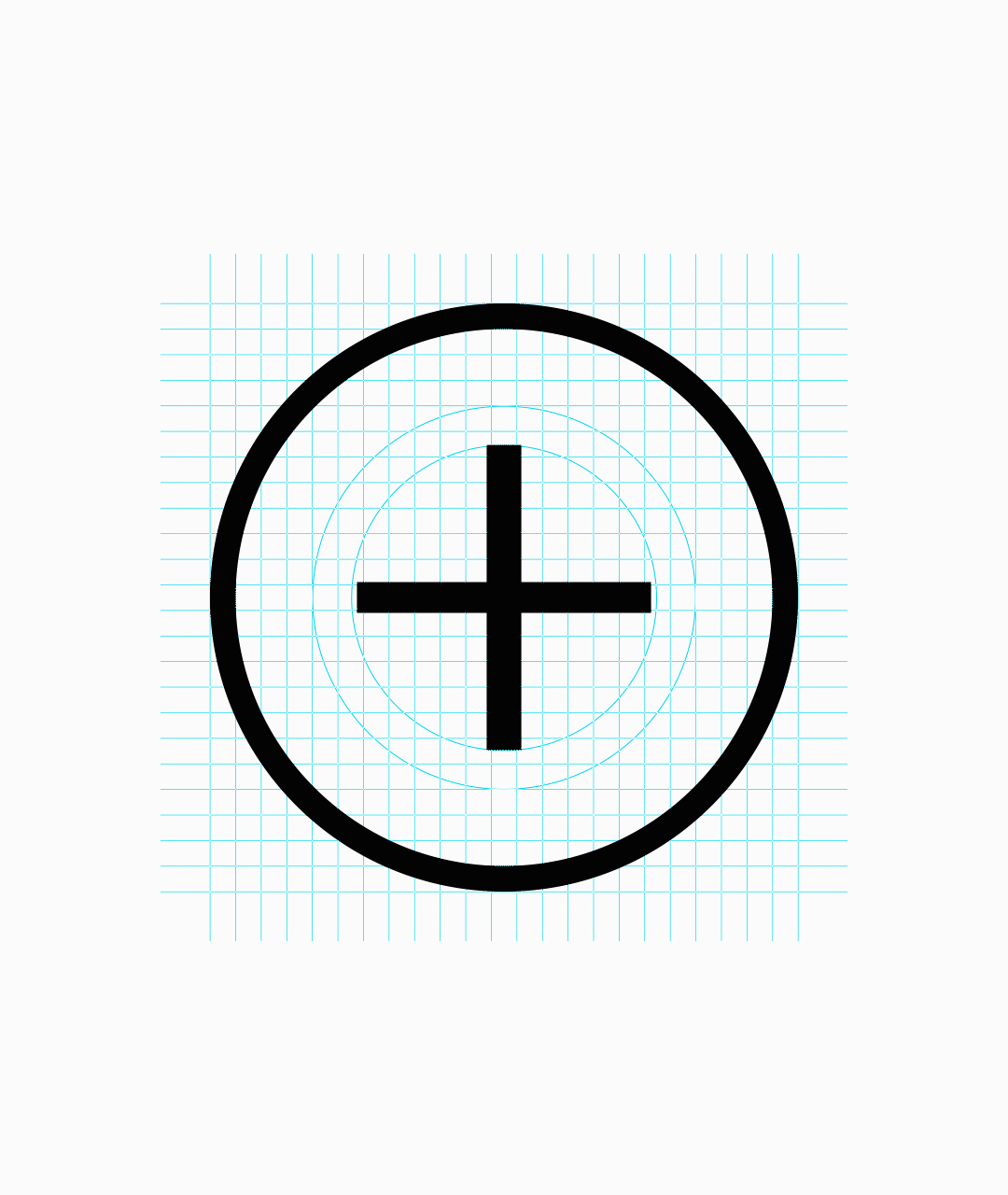
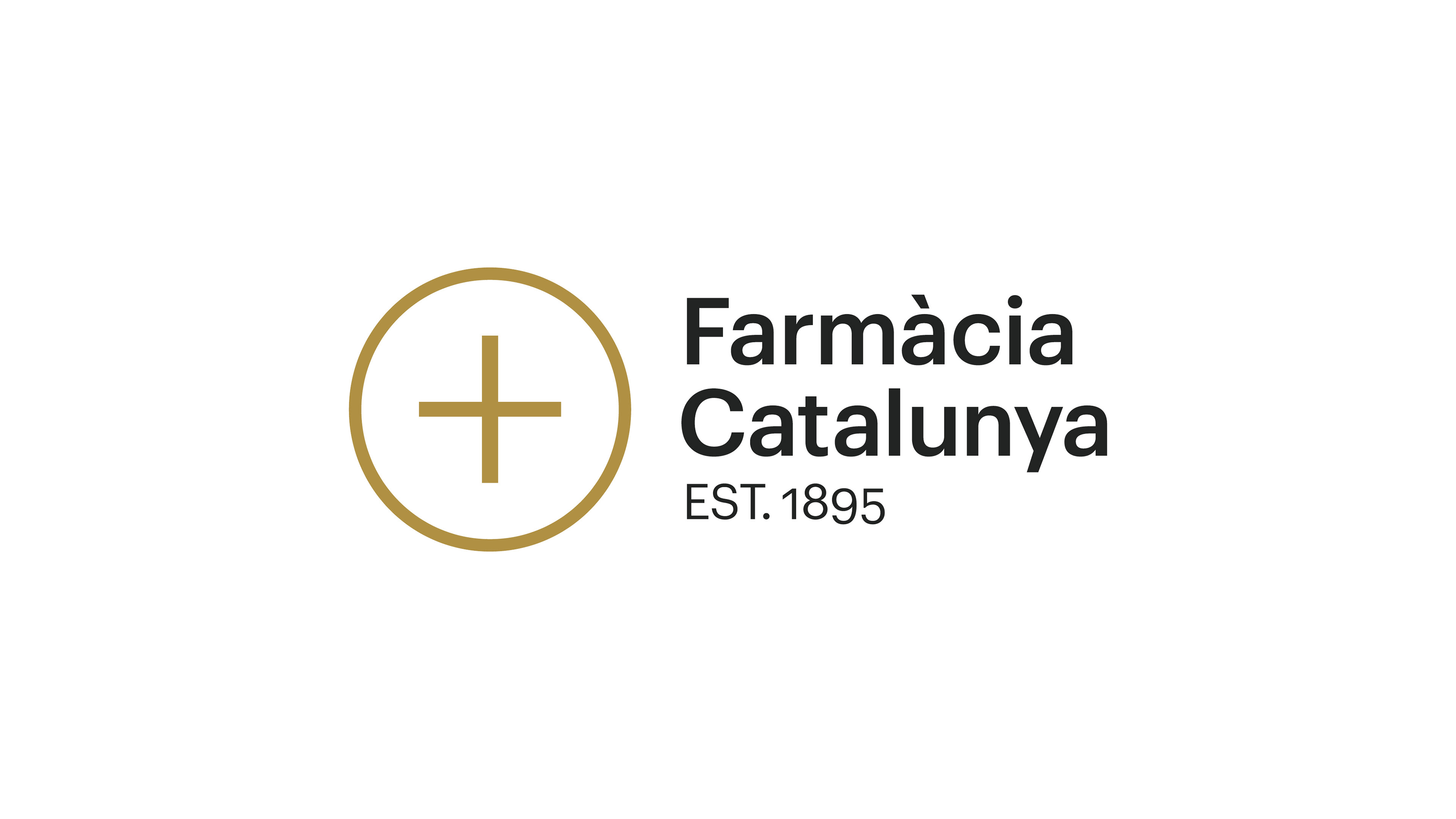
We define a grid to build the logo and to create the icons. Adjusting vertical and horizontal visual thickness, and compensating the inner white of each group of shapes we get a well balanced icons set.